Frankly speaking, we are not going to talk exactly about design (you may have noticed we are in the Marketing section:) But we will talk about the main message and some tips that will help to build a memorable About Us page.
First of all, you should figure out what's the main purpose of your Aboutpage. Well yes, it's about your company. It should include your history, your products. Maybe some info about you personally (CEO) or your team. This all should be included, indeed. But the most important thing about that page - it should answer the question: which problems do you solve for your customers.
The very important tip you should always keep in mind is that focusing only on your product, your service, your business is rather selfish. You’ve made a whole website for this purpose, so this page is to reveal what’s behind the curtains. You must show people that you are the same human as they are: from flesh and blood, who also gets tired and loves to eat tacos. Think deeper, be creative. Make your About Us page look remarkable, so people will remember your product... or at least will rate your About Us page as incredibly catchy one;)
1.The Beginning
First what you see on the TenantCloud About Us page is the high-quality picture with eloquent quote on it. The philosophic line welcomes and makes you think about the Universe and decisions you make. Sounds quite interesting, so you are scrolling down. *Notice, the better quality your pictures are, the greater impression it makes on your visitors.

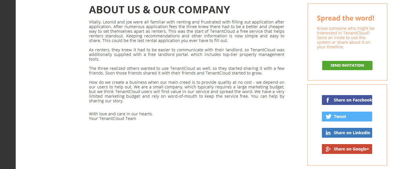
2. About Us and Our Company
As you can see, a short story captures your attention and you begin to read. No one’s gonna read a book on your About Us page, so try to be as brief as possible. Here founders share their story of how they faced the issue and how they found the solution later. They also ask you to tell your friends about it. Thus, to make the process convenient, social buttons are right at hand.* Notice, writing only about your product bores your readers. Writing about their problems grabs their attention.
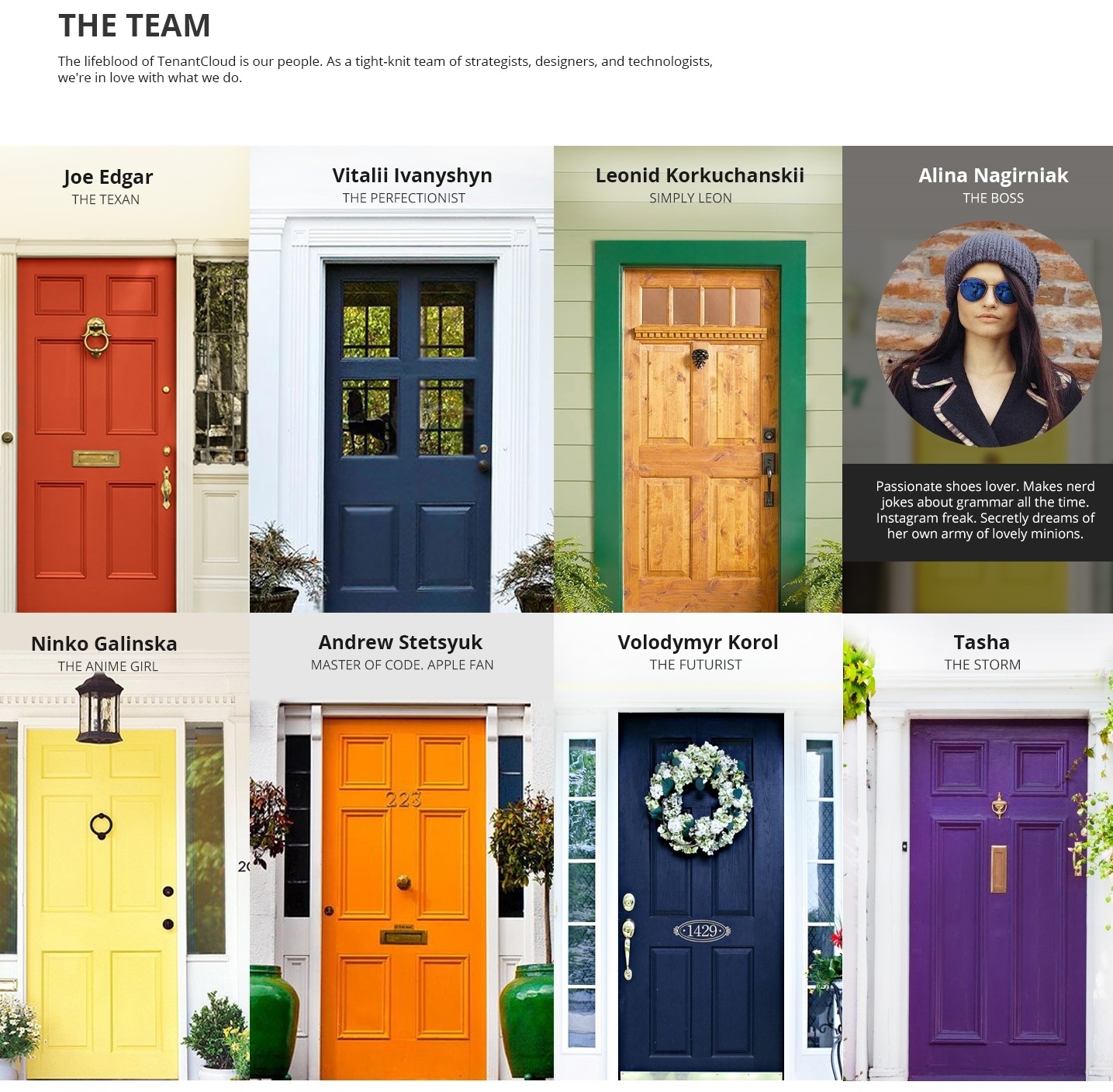
3. The Team
We’ve already mentioned a little bit about your company stuff. It’s great to show that real people work in your company and build a product or service. A photo for each member and a very short bio looks awesome. Many websites use this type and I should say this is the winning solution. But the question is how to design the Team section so it would grab attention?Well, even if it is a real estate sphere, still you can stand out. As TenantCloud service features property management system, you can see lots of doors and inside each there is a team member with a short bio. Symbolic and really creative way. Another interesting thing, they all have different title name and funny facts about themselves that will make you laugh. Another thing that will make you smile, is a persona not exactly from flesh and blood, but green substance and thorns... When you open the last door, you can see a little cactus named Taco with short bio. Hilarious and adorable at the same time :)
*Notice, humour in your texts will always be a big plus. And to make the page look awesome, you can buy lots of chocolates for your designer, so he could use his creativity at best. And don’t forget, team members as pets, plants or toys will make your page more remarkable.
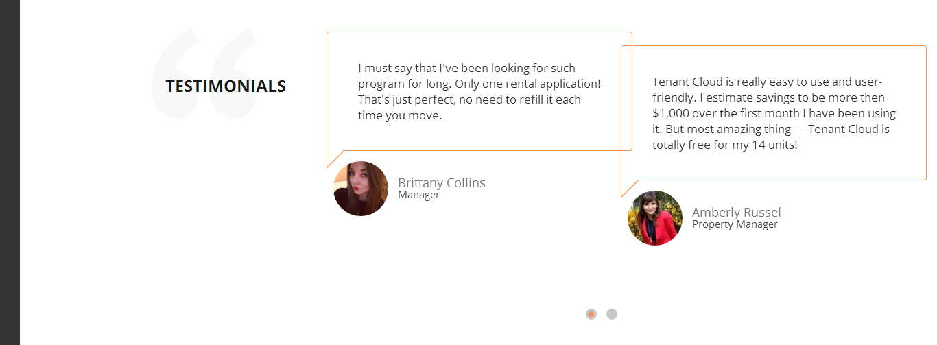
4. Testimonials
It’s a great idea to place some feedbacks about your service or product on About Us page. Simply perfect match. Where should people look for the feedbacks as not on this page?!*Notice, if your product/service is new to people, make a demo to your colleagues or find a top mind blogger, for example, and send a test product to get a review for your About Us page.
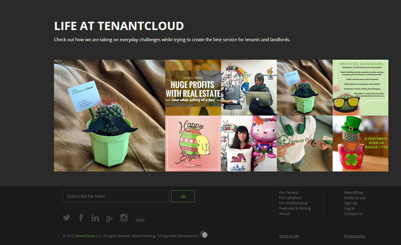
5. Photo Gallery (optional)
You may put a photo gallery on your About Us page or you may not. If there are nothing to show and it will take you too much time taking pictures, then forget about it. Gallery is not for you. Your page already looks great. But, if you want to make it look amazing - make a gallery. TenantCloud team embeded their Instagram account and made a gallery of 9 pictures, so no worries with uploading them - easy and smart.*Notice, You can take pictures of everything: your events and festivals, service/product promo pictures, everyday work or even your dressed cactus.
So, if you want to make your About Us page look really catchy, use tips that I have mentioned above. Be inventive, creative and laconic. Also, if you know some gorgeous About Us pages, share ‘em in comments, cuz I’d love to check out!
That’s all, Folks. Stay tuned with Ukietech ;)

