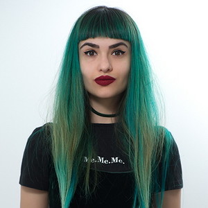
Today we have an interview with Nina Galinska (AKA Ninkoo), Head of Ukietech Design Department.
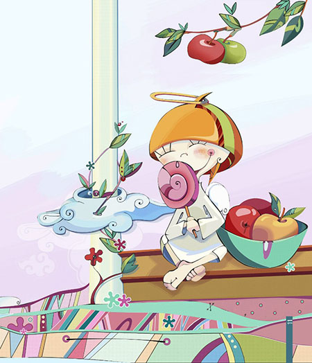
Nina, you often draw cartoon characters, this is your unique style. Please, tell us, what inspires you to draw these cartoon characters and how do these characters even appear in your head? do you have any special techniques?
I have been drawing these pictures from a very early age. These heroes are always in my mind. And, I don’t how did they get there :). Frankly speaking, I don’t like realistic images. Furthermore, I don’t like anything that can be explained logically. And it works like that not just with images, but with the entire world around me. Earlier, I was drawing everything on paper, now I prefer computer graphics, as it is much more convenient and works better for experimenting. And, now we have new opportunities and we should try something new, we have to develop ourselves.
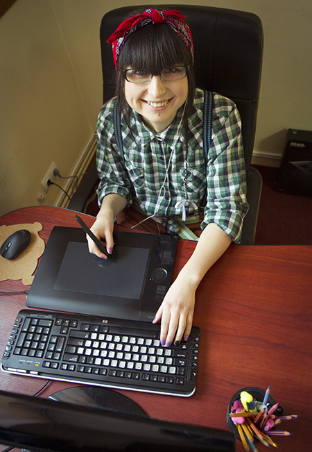
Why did you get into web design specifically? Why not graphic design or something else?
Web-design is a specific design sphere, which though includes graphic design too, but in a much broader sense. Web design has much more options, such as adding animation to images, different interesting effects, changing color and size. But, there are some negatives. Sometimes you can’t put into life all that you planned because of some technical or functionality issues. And, sometimes I have to fight with developers for the right pages layout and so on :).
What do you consider as the main criteria of a good website design?
When I just started to working as a web designer, the most crucial thing for me was still the outward. Having seen something interesting, beautifully visualized on a website, a person will go and look through it, in spite of whether she or he is interested in there is information or not. Because we use to judge by appearance. Now I see that within each new experience I make sure that usability takes the same important place. But the more you follow the standard convenient composition with website header and footer, the less space it leaves for creativity.
Thus, I believe that visualization is a priority, as well as intuitive navigation, easy content perception, clear and clean space without overwhelming stuff. At the same time, I think, the site must be alive (and not just being an image), all the elements have to react on clicking or mouse hovering and sometimes even amaze the visitor with something extraordinary :).
You have to often work with 3D and web graphic together in one project. Can you share with us your specific experience? What is the main work features at such projects?
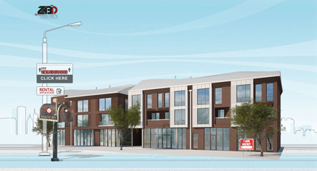
At first, I have to say that I’m not drawing 3D. Our 3D-designers make the 3D renderings for our projects. My task is to incorporate it on web-site. It’s very interesting. If the site contains 3D rendering house, they should be accurate and organically placed in the site design. It must be done in order to achieve impression of space and volume and the house can’t fly on air or look as it is excessive on our site. Such projects contain the combination of different graphic origin. That’s why it is very interesting experience.
You reveal the secret of managing the designers’ team? What is the most important thing in this delicate process?
As in any team, you need to set tasks and track results. However, managing the team of designers has some peculiarities. Sometimes design doesn’t look good at the first time. Or it happens that a designer can stuck on some design moment. Firstly, designers need a little freedom. They need some time to look for analogue and reference sites or some inspiration, as it’s not wise to invent the bicycle again. It’s better to develop a new thing, basing it on the old one.
Designers don’t like to get micro-managed with an avalanche of comments and someone looking over their shoulder.. Being hyper-controlled, a designer gets nervous and starts panic, so it isn’t likely that he/she will achieve a good result. We all are afraid of being criticized, and the designers are twice afraid of it. But it is important to set some short meetings and show up the new work. Fresh looks and inputs are always welcomed. Also it’s crucial not to switch a person from one task to another. Such changes are always misleading from new ideas.
Of course, positive atmosphere, smiles and wishing a great day are doing their best! And still don’t forget to check the tasks in the end of the day ;).
Describe your creative working day
- My working day begins with a cup of coffee and a “play” button on my player.  - Then I am checking my tasks and mark the priorities
- 5-minutes team meeting to coordinate plans and tasks
- And here we go! Checking several creative sites to get inspired
- Working upon my tasks
- Coffee time
- Again designing hard…
- Sometimes I have launch :)
- Again designing
- Discussing the works of my design teamsters
- Sum up of the day+coffee
What is your hobby?
My hobby… mmm… I think it’s painting. Different cute things. And also I want to improve my skating and snowboarding skills.
What is your source of inspiration for work and life?
At first it is the time which I spend alone. Right away when I stay alone in the room, those different things, which I want to do, start coming to my mind.
What your project is your favorite one? Which one was the most challenging?
The most challenging was and remains EVA project, because I was up to draw a huge amount of icons:) . Still I’ve loved that project. And what is my favorite one? Well, I don’t know. Yet I think I haven’t finished a project, I can be really proud of. I’d like to believe it’s still ahead.
What is your design achievement of the year?
Maybe, it’s again EVA project.
What advice would you give to new designers-beginners?
Study, follow the new technologies, read a lot, check many design examples, experiment and WORK, WORK and again WORK! Because the experience is a WOW! Remember: every next design project always gets better than the previous one :)
See also: Retouching skin and adding texture

