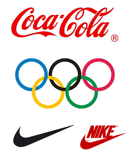
Logo is the central element of any company’s brand to define its recognition. This is the image of of the company’s name, its face, reflection of style and the first impression to most people.
Here are some rules that will help you to create a professional looking Logo that will succeed. Here we go:
Compositions rules:
1) Less colors and fonts
It is not desirable or recommended to use more than 3 colors or 2 fonts. Logo’s need be vivid, clear and distinct.
2) Use the right font
Statistics says that logos of the most prominent companies were made with simple, readable fonts, like Arial, Times New Times New Roman, and Helvetica.
3) Design as simple as possible!
When creating the logo, the image has to be easy to remember and recognizable
4) Avoid highlights, gradients and shadows
All of these are connected to the next rule, but are very important due to the logo composition. Each of these effects distract and are difficult to read.
Structural rules
1) Logo should be easily transferred to different sizes
It should be just as recognizable on an envelope and a billboard. There are a great variety uses for logos, such as websites, mobile applications, mugs or hats, and much more.
2) It is important that your logo translates to black and white
e.g to print an article in the newspaper, or release a notebook with the logo, etc...
Conceptual rules
1) Logo should obey the rule "KISS" (Keep It Simple Stupid)
It should be unforgettable and vivid and stylish and at the same time simple
2) Forget-it-not Logo
Make it unforgettable
Creating a Logo is art and science in one. Here are some examples of great logos:

And examples of logos today:

See also: Responsive Web Design from a Designer's Point of View

