An icon isn’t a new and unfamiliar trend. We encounter icons nearly on every website. But to make it crystal clear, I’ll explain what an icon is and how it is created.
An icon is a clickable button that is visual or graphic in nature that matches its function and executes a specific action.
In my latest design project, I am dealing with a lot of icon solutions and I really enjoy it :). One of these projects is a psychology website project where each menu category features its own icon design.
![]()
Now I am going to explain how to create an icon such as this step by step.
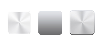
At first we have to create a shape of an icon that suits our design. In my case it was a square with rounded edges and metal texture gradient (you can create one using the example on the print screen below)

To make our icon look more volumetric, I set the transparency to 75% and drew a similar figure, proportionally 4 pixels larger. Then I set a dark-to-light-gray gradient and put one figure on top of the other.
The next step is to create an image that matches the form and the function of the icon. To achieve a better effect, I usually draw the image in two color styles. I also add a shadow that will appear on a mouseover and will indicate the active or inactive position of the icon.

And here it is... the final result!

Try to draw your own icon, it’s very exciting!