Hello, everyone. I would like to talk about the new web design trend, in particular, working, designing, developing in Web 3.0 approach.
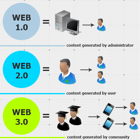
First, what is Web 3.0? To start, Web 3.0 is based on Web 2.0 and this third generation of the internet will store much more quality and better filtered content without reposts and the mess. And this ‘better content’ will be created, not by users, but a team of professionals. Therefore, it will be compact, clear and much more easily accessible. There’s even a joke about different stages of internet generational development:
WEB 0.0 – a user dreams to connect to somebody or something
WEB 1.0 – user receives content
WEB 2.0 – user creates content
WEB 3.0 – collective creation of content
WEB 4.0 – content thinks for the user
WEB 5.0 – content talks to content
WEB 6.66- content deletes users having realized they are senseless

Funny, isn’t it? But, let’s get back to the design issues. The main difference with Web 3.0 will be its multi-device orientation (adjustment) and also the content will be of higher priority to visualization.
In essence, Web 3.0 will be known as “the portable personal web” focused on the individual lifestream, consolidating dynamic content, the semantic, web widgets, drag & drop mashups, user behavior (“me-onomy”), igoogle, netvibes, user engagement and advertainment.
Also, while designing in Web 3.0, the focus will not be so much on the graphics, but font-styles and better, more efficient layout in the text blocks. You can read more about it in one of my previous blogs.
Any and all, Web 3.0 website design will have to be intuitive and interactive. Netizents should easily be able to get access to desirable content, and to do this, one needs to use HTML5 and CSS3 that are Web 3.0 trends. In certain cases, Flash and JavaScript can be easily replaced by HTML5 thereby making web page source code shorter, clearer and simpler.
HTML5 is not a miracle, but very functional and interactive decreasing graphic elements with the help of many various effects such as: rounded angles, shadow or gradients effects, 3D and animation effects as well.
Web 3.0 websites are all about mobility and cross platform.
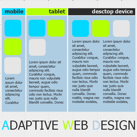
Nowadays, in the era of smartphones and tablet computers we have to be attentive and design with the goal in mind that websites will be displayed many different size mobile devices, as everyone wants to stay connected to their favorite websites or social networks on the go.

So, when designing for mobile devices there are a couple things to take into account. The first one is to create a simple, smaller designed version that contains clean information, images and hyperlinks that are more efficient with high-quality adaptive design. With adaptive design, the website not only responds to screen size, but also adapts so that you have the right functionality for your device. Adaptive design allows you to create clean & professional looking versions of any website, whether you browse it through smartphone, tablet or any other device connected to the internet.
On a touch device, users will easily jump between website sections with use easy touch navigation.
In conclusion, I will dare to hypothesize that future websites won’t be the same as we now know, with the bright and vivid design, 3D and animation effects.
Content will be the most important, databases will give the access to users from any device at any location on the Earth. This content will be provided with the special add-ons, and browsers of the next generation!
See also: Easy short movie tutorial

