As you may have already learnt from the related `The Perfect Call To Action Color` article, effective buttons come in all different colors. Another important thing you have to know about call to action buttons (CTA) is that they come in all sizes, shapes, places but though, attention (!), there is really no one-size-fits-all solution that works every time on every page.
While there are some tricks and tips with CTAs, you should remember what actually works will vary wildly depending on context and the layout of the landing page. So, there is no common formula that works with every landing page. But still, let’s return to some tips and tricks, exactly to size, shape and position.
1. Size
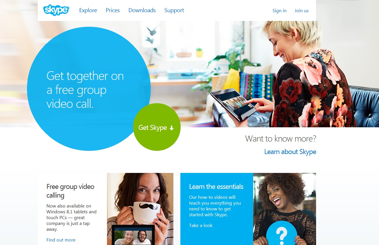
The perfect call to action button should strike between overcrowding elements on the page while matching the web page background. Most of the time it should be the largest button on the page, because the bigger it is, the more it indicates of its importance. Large button gives a good eye-catching effect, as it is the first thing you notice on the page.
When choosing the size for your button, don’t forget to overlook other elements. Also, remember not to go too far with its size, because users will not understand that it is clickable and may just scroll it over. In other words, give your button a size that matters, as bigger is not always better.
You can imagine there is no point in telling you the perfect dimension of a button because it simply doesn’t exist. Make sure it looks aesthetically pleasing but never forget to test.

2. Shape
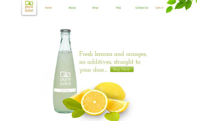
Nowadays CTA buttons became doorbells of the internet. The best ones feel easy and unobtrusive. It is a wide practice to make rounded corners as studies have shown that people are unfavorable to sharp edges. There is a common opinion that people subconsciously overlook sharp corners, as they can indicate some kind of a threat. And another important thing concerning the shape, if you want people to click, give them something that’s clickable. Use shadows or other graphic techniques to allocate the clickability of the button.
By the way, in a recent interview, conversion optimization professional Bryan Eisenberg shared one of his opinions on CTAs: try to use irregular shapes (rather than typical rectangle, square or oval shapes). This includes buttons in a forms of big plus signs or shopping carts. It’s the nonstandard of the buttons, that catches the eye and captures the click.
Sure, there is no shape that works in any way on any page. Sometimes your website converts better with a traditional button shape and sometimes your button brings more conversions in a shape of a cat. So keep testing :)
3. Position
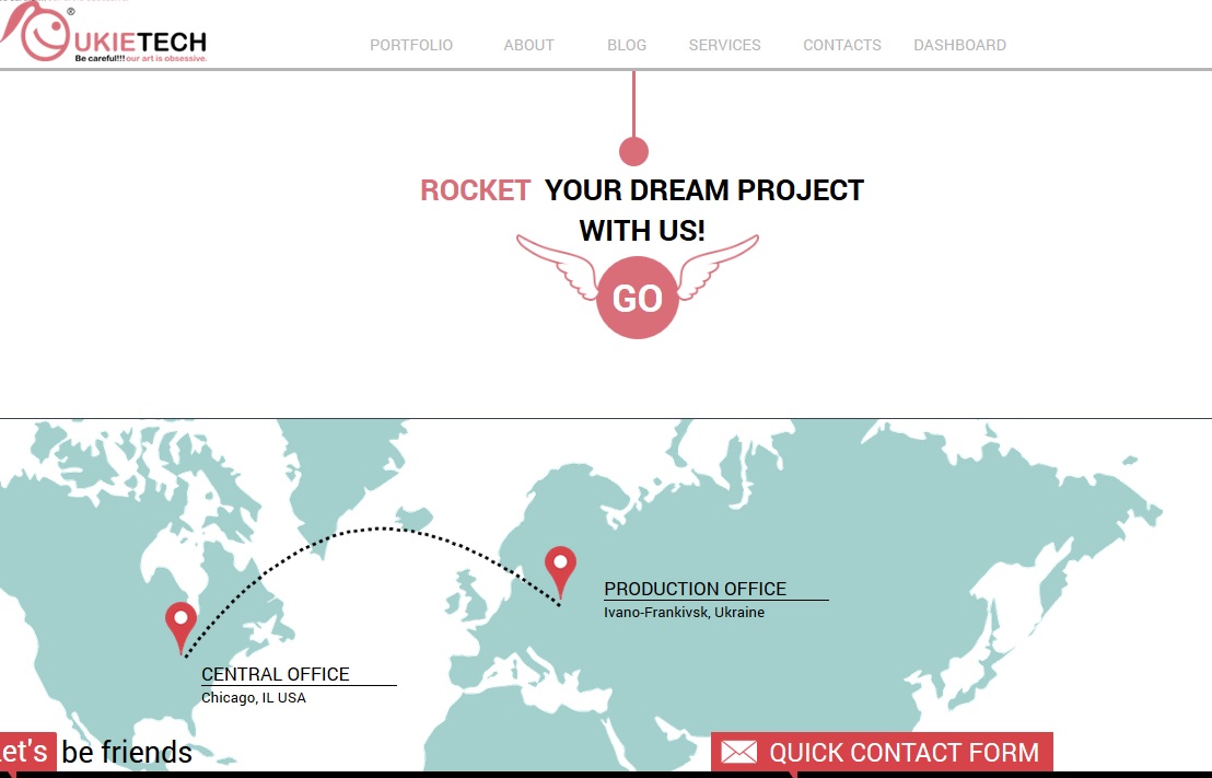
To begin with, exactly where to place the call to action button depends on a number of factors, including the level of interest of a visitor and the overall design of the page.
Placing the call to action button above the fold of the web page is the most effective as this area is the first impression one has of a business. It is the top of the page and visitors are likely to notice your call to action button at once. So, don’t be afraid to draw your visitors’ attention.
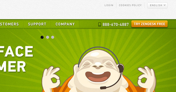
You can duplicate the CTA depending on the length of your page. If it is too long, you can put one in the middle and one in the end of the page, so as to make visitor click on it without returning back to the top. However, don’t forget to make sure that your call to action button has appropriate size, that it is visible enough and has spacing from other elements.
Share what works with your CTAs and write us in comments!
See also: Why Your Ecommerce Website Is Losing Money (infographics)

