
1) In order to start let’s pick a good looking font. I recommend using Google Fonts with free of charge fonts or DaFont website with fonts you can download for non-commercial use only.
I like font called Quartzo from DaFont.com – this font is free of charge for personal purposes. Considering that our logo is noncommercial and I am using it only for demonstration purposes, this is just what we need.
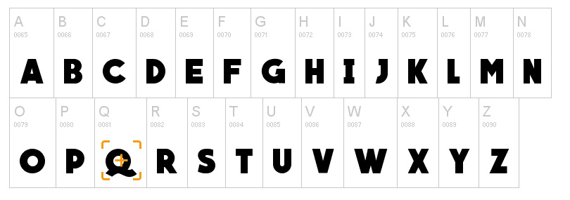
IF you wish to use your logo for commercial purposes having the same font, you have to contact the author in order to buy the license. Refernce links to the authors are available at dafont.com
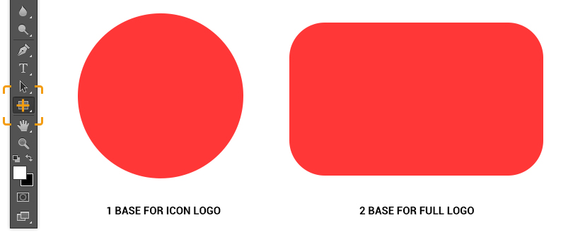
2) Start Photoshop and create a 1000х500px blank sheet. You may use Cntr+N for that.
3) Draw a circle to make a ground for Icon Logo and a rectangular with rounded corners for Full Logo – these will be your bases for the logo. I used ellipse tool in order to to do that. At this point you can use whatever color you like; it just does not matter now.
4) Select a font you need from the font list and type the first letter from your brand name. I am using an imaginary brand name Qmod so my first letter is Q.
This character will be the biggest one and will draw most of attention so let’s place it in the middle of the circle. Now I wanna add some individual feature to our logo and add another circle in the middle of the ‘Q’ letter. Make the circle a bit smaller so that the letter is slightly bigger than the circle. This will be the main logo.
This way we have made a mini logo that can be used for an icon or a badge.

5) Now let’s move on to the full logo so that the brand name is completely visible. Set your basis, that is a rectangular with rounded corners. I am placing ‘Q’ more to the left side and typing the rest of the letters in my brand name – MOD.
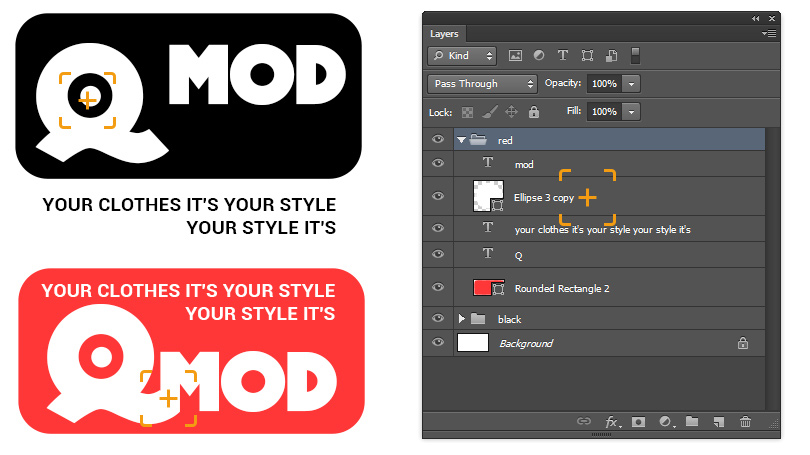
Note that our ‘Q’ and ‘MOD’ were typed in separate text layers. This was done on purpose to make them look creatively in the logo. In my case I added MOD as a continuation of letter ‘Q’. You can try anything else in your logo. Try experimenting with the font size and the order of layers.
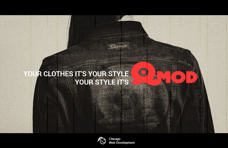
You can also add a catchword, if you like. For instance, I invented this one: Your clothes is your style - your style is QMod. Using a slogan, be sure you use a simple font for that. Your slogan has to be easily readable and understandable. Sometimes, brandmakers use just the name of the company when logo is represented with a symbol or an icon instead of text.

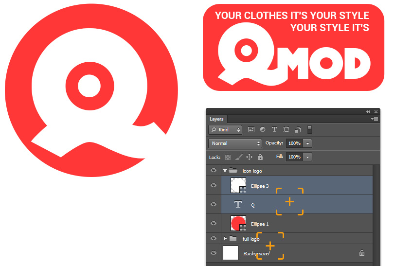
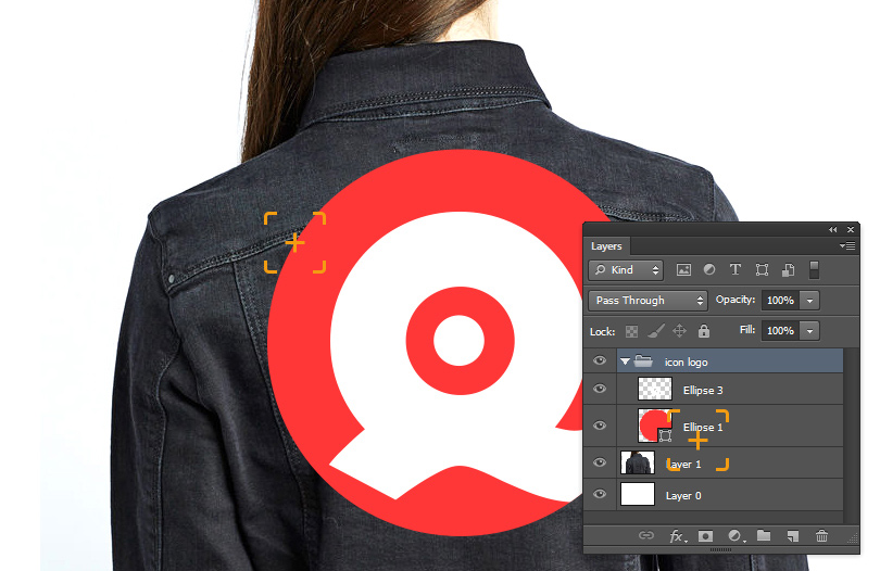
Before preparing a mock-up for a realistic logo I still need to do some editing of the logos we prepared earlier. As you noticed, we have two of them - Icon Logo and full Logo.
They both consist of fonts and figures and we should merge the layers to simplify our work with the logo. In order to reach that, let’s do the following:
1) Rasterize all the layers of figures and fonts one by one and combine them afterwards pressing Ctrl + E, so that our basis is separated from the text. Select the layers needed and press Control + G
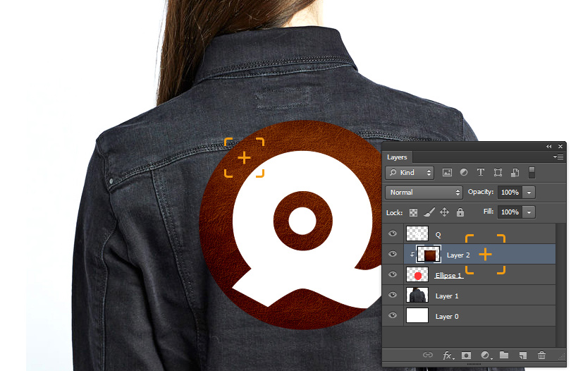
2) Search for a photo we can place our logo on. I downloaded a random picture of a jeans jacket. Open it with a Photoshop new sheet and drag the combined logo onto the picture.
3) Select an additional texture for the logo basis. In my example I am using a leather texture which looks nice with a jeans jacket.
4) I am moving the leather texture to the logo basis. To do that I need to arrange the texture right after the base layer in my layers list and holding Alt I drag my cursor in between the layers until I see an arrow and click my left mouse button. The leather texture now fitted the shape of the base.
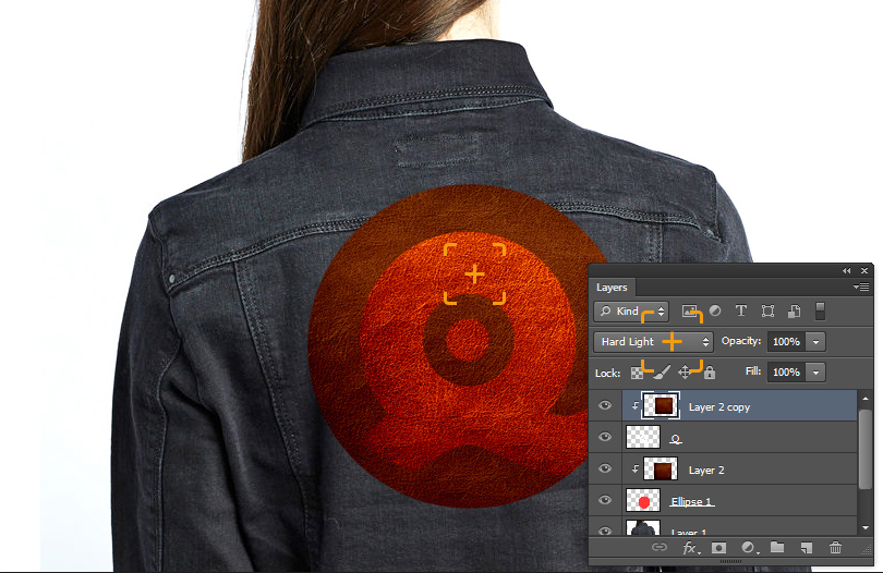
5) Let’s do the same thing with text starting with our letter ‘Q’. Besides, you can play around with options of applying layers to visually divide the image.
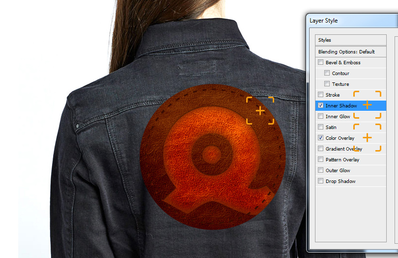
6) For a better effect let’s add a stitch around our label. I add one more circle figure using Ellipse tool. This will be slightly smaller than the label. Then I pick Type Tool and click on the edge of the circle so that the cursor becomes a rounded text. Then I type a ‘-‘ symbol on my keyboard and click repeatedly until I get the full circle filled.
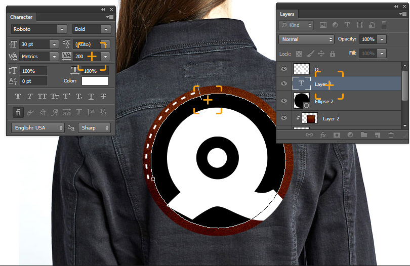
7) I also add some volume to the stitch using Layer Style.
8) I combine all the layers in one pressing Ctrl and I click on each element of the logo in my layers list. Then I press Ctrl + E to merge all layers.
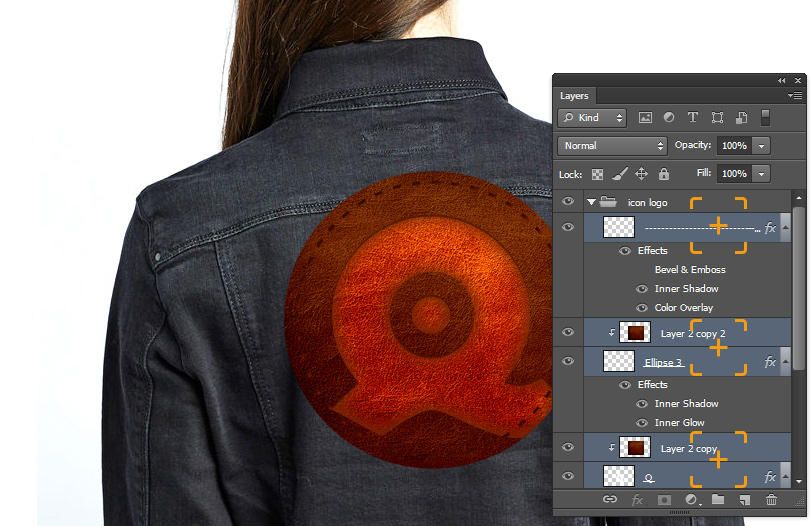
9) Now I need to add effect of applying logo layer onto the jeans jacket layer using - Blending Options and transparency.
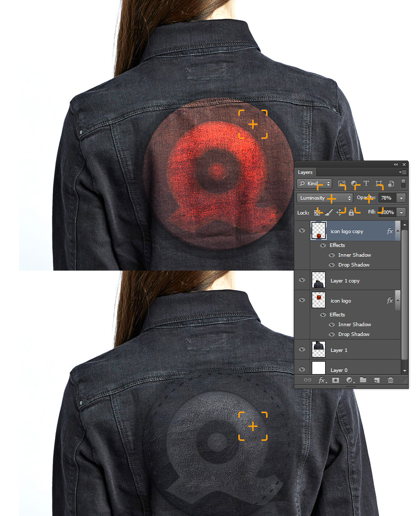
The result we get looks like this.
You might notice that we did not use much time for logo detalization as well as its placement on a textured surface and our tutorial was meant for elementary understanding of principles of creating and applying such a logo.
P.S. All fonts and images used in this tutorial belong to their owners and are shared according to the licenses provided. The material was published for demonstration and education purposes only. Any similarities to existing brands that might arise are solely coincidental and unintended.