So, ideal web design formula is - modern design + flawless layout + perfect programming + usability + something really special. Wonderful, isn’t it? But unfortunately can be not enough to maximize the effectiveness of your site.
Each website is unique and before you start doing it, you must clearly understand your audience. This will make the process of creating your website quite easier, though, creating a website is not an easy thing to do. But if you do it properly, it will help you gain more profit and awareness among your potential customers. The best option is to trust creating your website to experienced company, like Ukietech Creative Corp. But, no matter what your decision is, be sure to stick to these 5 important tips that will help you build the perfect website:
1. Cleanness and simplicity
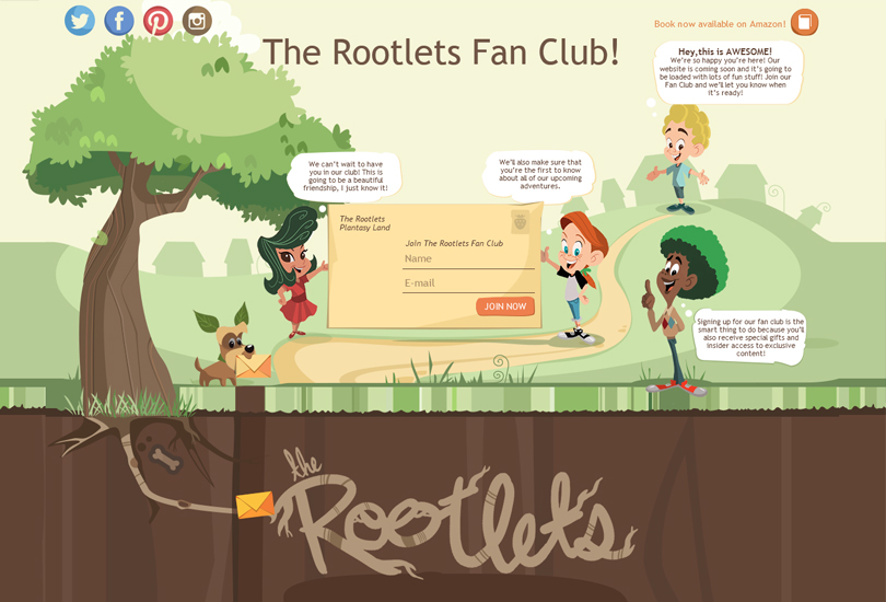
What do you feel when you see a million ads, banners, icons, badges, signs, pop-ups, buttons all on one page? You want to make it disappear. What do you feel when all that stuff goes away? You get a feeling you came in the right place. Give your site visitors a break from all the noise and clutter. In this case flat design and white space are perfect for your site visitor’s experience. Try to highlight only important content and keep the rest minimal.
2. Call to action visualization
Usually our eyes pay attention to web space in a certain directions that help to optimize important content on your site. For example, if you create a ‘book now’ button, you need as many people as possible to click it and go through the whole booking process. There is such a thing, called visual hierarchy which means that the eyes move top to bottom, left to right. This means, you must put only important content in these areas. You might not get a desired result if you overwhelm these parts with too much information.
3. Readable texts
It is really important to provide your website with texts that can answer questions, before your visitors may ask them. But don’t make your potential clients call for Sherlock for this purpose. Place information clearly on your website. Don’t forget to make your colors work together. Don’t use too small font size. While it might look cute, it’s just not practical. Make sure the fonts you choose are reader-friendly. Too much is not always good. So try not to use all font styles there are in the list. Choose several and stick to them, as well as to your color scheme.
4. Big Images
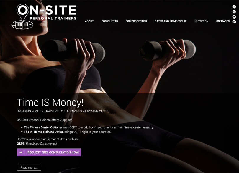
You may not believe this, but yes, big and high-resolution images can make your website look delicious. In most cases users decide whether they’re interested in your website after they have been staying only few seconds on it. A big image can keep them interested and will make your site look much more professional. Many great brands like Apple, Nike use this tip. Besides, there are many free photo stocks where you can find big images without any problems.
5. Mobile-friendly
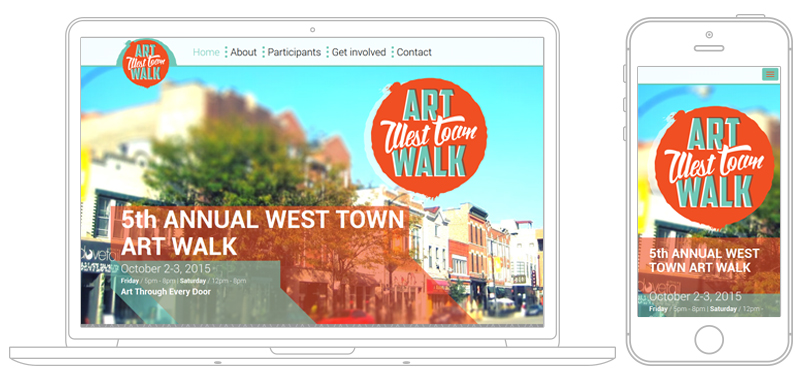
Year by year the number of users who enter the Internet through mobile devices is getting bigger and bigger. You must understand that users will not recommend a company or product if it does not have a normal mobile version of their pages on the Internet. If a simplified version of the site does not meet the expectations of 40% of the potential customers, they deliberately go to a competitor. According to recent data, the vast majority of users have more than one device to connect to the Internet, and switch between them several times each day. So, you now understand how important it is to be mobile friendly. Nowadays it’s really crucial.
Good luck with your Ideal Website. If you have already done yours, share it in comments. If you still searching, you can request a quote at Ukietech Creative Corp. We would love to make Ideal web site for you :)

