In this digital time we see call to action everywhere in all different colors and shapes.
If you weren’t sure, call to action is a term for some elements of the webpage (mostly clickable buttons) to lure user’s attention, so they want to perform an action. Maybe you’ve seen such examples like “Register here”, “Buy now”, “Learn how” and so on. I was surfing through the internet in search of ideal colors for call to action button, but soon I didn’t find a satisfying answer. There was no ideal color tutorial.
So, I came up with an idea to write tips on a perfect color for ideal call to Action. We should go through a few key colors, so come on.
Аs you know, each color plays its own part in general perception. No matter how different people are, the perception of 70% internet users is the same. As researches show, there is a specific emotion linked with each color. It’s essential if you want to guide a user through a web page and evoke a feeling to perform needed action, so color is one of important tools in your arsenal. You must know how each color acts. Sure you shouldn’t forget about such points as the massage, the shape and the place of the button, but we will talk about this later. So, here we go with a little tip on how to choose the right color. Let’s talk about the main:
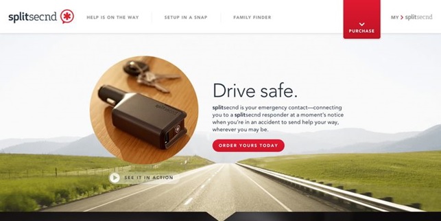
Red (classic call to action color) – draws your attention as this is an alert color, which increases your heartbeat by activating your pituitary gland. It is notable almost on any background. It is also the color most associated with dynamism and activity, that is why frequently used in advertising.

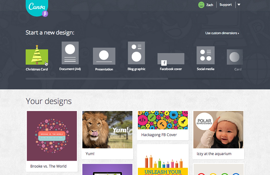
Green (good for sign-ups, testimonials, founder’s story, etc) – a friendly color, bright and easy for eyes. Do not irritate one’s eye, but distinguishes the button on the page if design was made right. Often linked with nature and peace, as a result you get a call to action button with a feeling of safety.


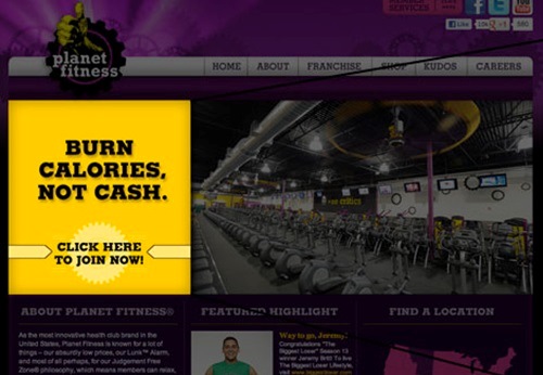
Yellow (the first color a person catch) draws attention to your call-to-action, wherever you decided to put it. Yellow is a color which cries out for attention, especially on a dark background. Users may instinctively want to click on yellow call to action button, as it may seem warm and jolly color.


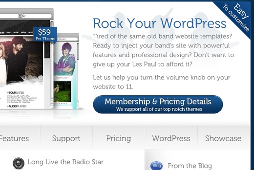
Blue (unobtrusive one) - marketing surveys in the U.S. and Europe show that blue is the color most commonly associated with harmony and confidence, and sometimes with sadness. When talking about blue as color of call to action button, there is an opinion that blue may make your visitor reconsider the action or think twice before clicking. It is the color of peace and no one is about to rush.

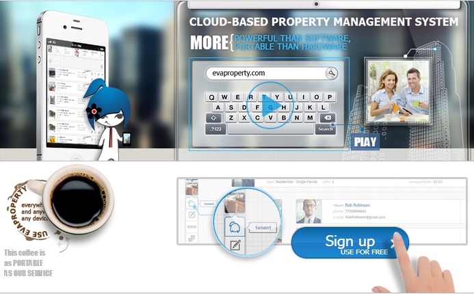
Orange (perfect call-to-action) combination of aggressive red and cheerful yellow, notable and warm one. In Europe and America, orange is most associated with amusement. As researches show, orange call to action button is the button of engagement. Orange CTA buttons are most commonly used in online advertising, as they bring the highest click rate.


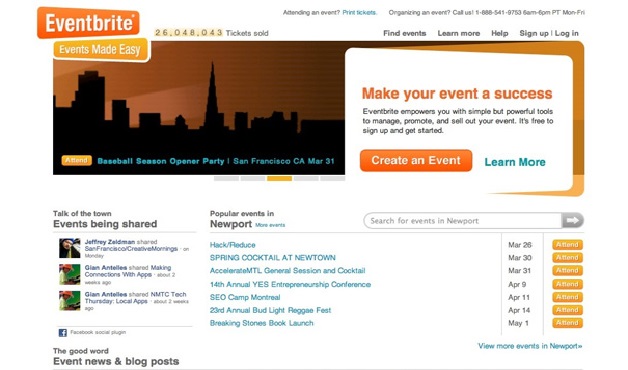
Anyway, no matter what color you choose, try to test and analyze it! Just like all other online marketing activities, CTA button effectiveness need to be measured. And then you will see if the color you have taken is perfect for your website or need some improvements and modifications.
Notice, visual effects used to make your button to stand out can have an impact on how much your button gets clicked, but remember to act carefully, as even relatively tiny effects can have a really big impact – and this impact may not always be a positive one.
Test and practice, combine and experiment! Only then you’ll get a CTA button you have always dreamt of!
See also: 7 Top Reasons Why They Leave Your Website

