The term of “emotional design” was defined by Aarron Walter. Aarron Walter is the Director of User Experience at MailChimp, where he strives to make software more human. Aarron is the author of Designing for Emotion from A Book Apart. Aarron taught design at colleges in the US and Europe for nearly a decade, and speaks at conferences around the world. His design guidance has helped the White House, the US Department of State, and dozens of startups and venture capitalists.
Walter believes the product or design must be functional, reliable and useful (and in exactly in this order) to leave the customer satisfied with it.
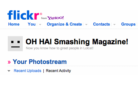
“OH HAI Smashing Magazine!” is one of the dozens of greetings that Flickr uses every time you access the site. While, this little detail is easy to overlook and Flickr will most definitely continue to work without this little feature, it is details like this, that you will notice when it is absent.

This is just one example of web design details, which can elicit a users reaction and interaction. These little functionalities can evoke a users positive emotion. They are added to the website specifically to engage the user. Simple details like this help and enhance a users web experience and may cause them to talk about the product to their friends and relatives. this type of engagement is called emotional design.
The main goal of emotional design is to evoke positive feedback and engagement from users. Positive emotions become positive opinions and then into the desire to use your product in the future.
If users have a positive experience and engagement with your interaction then it is much easier to handle future difficulties and inconveniences with your users. But, the bottom line is that nobody can forgive you for bad design. And, beautiful visual designs can make your users more forgiving with interface problems.
Below is a list of positive emotions that user like. Certainly, people will react to these things in different ways depending on their age, knowledge etc., but generally these psychological factors will work:
- Joy
- Surprise (do something unexpected and pleasant);
- Uniqueness (distinction from other similar products);
- Attention (offer to help, even if you are not required);
- Attractiveness
- Expectation (tell something interesting about the product just before its launch);
- Exclusivity (offer something exclusive for a certain group of people);
- Prompt response (show the ability to react quickly to the situation of the audience, especially if they do not expect anything).
Some examples:
Smile
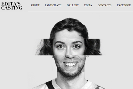
People, who are having fun tend to repeat the facial expressions of each other. When a person you like smiles at you, of course you will smile in return. You can use this ideology also on your website. Emotionality can highly depend on photos, especially when there human interest with stories behind them.

Error pages and technical pages
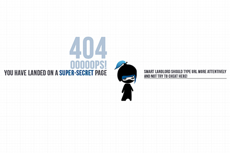
Certainly, there is nothing more frustrating or boring on the internet than technical pages (or service pages, pages which appear when the site is inaccessible) This will upset your users, especially if they depend on you for information or purchasing something. Emotional design will help you to make those pages not boring, but even interesting.
Funny character
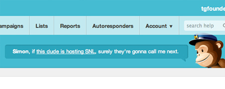
One distinctive feature of MailChimp emotional design is a monkey, which is called Freddie. Freddie picks up the users mood while your page is loading. And he also inserts jokes where necessary to engage the user)).

See also: Website design with Web 3.0


