First, let’s understand what a parallax effect is and define it’s types.
The parallax effect in web design means dynamic movement of background images, where in background images move slower than the foreground images, creating an illusion of depth and adding to the immersion. The technique grew out of the multiplane camera technique used in traditional animation since the 1940. There are two main types of parallax scrolling - vertical and horizontal scrolling, however we shouldn’t forget about other types of scrolling like diagonal parallax scrolling. The extent of the parallax effects depend only on your imagination and ideas.
In this article, I want to tell you how to draw a simple layout design for horizontal parallax scrolling using just simple geometric shapes in Photoshop.
First of all let’s define the topic and choose the appropriate size for our layout. I pick the standard size for most screens, 960px horizontally and 500px in height.
I think it would be a good ratio for the header of the site with horizontal parallax scroll. Without thinking to long, I’ve decided to draw a layer in cosmic-style. To do this, create a blank sheet with the appropriate ratio and fill it with the necessary color. As for me, I chose a deep purple (# 04002d) color to convey the depth of outer space. To make our first-level background image a little more interesting, let’s modify it by adding two filled circles. I chose colors from one purple gamut but slightly other shades .
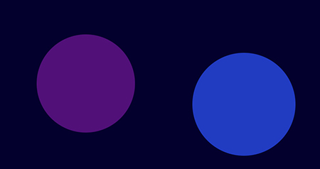
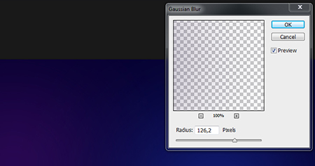
Having created two filled circles (gradient) let’s use the Gaussing Blur tool with a blur radius 120px-140px.
Then we can unite all layers in one and duplicate it. Then, in the upper duplicated layer we use the Render filter - Clouds and change the layer blending mode (Blending layer options) Color Dodge or the other one ( depends on layer blending results).
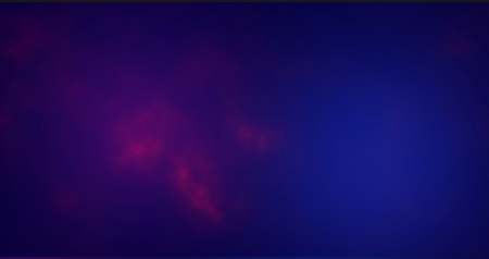
Save a version of your image as a background image-1 in JPG, but do not close the PSD file, because we need it for the next step.
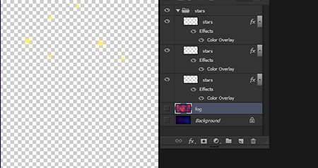
Next, I want to add a second level of elements – stars. I create several small circles and fill them with a nice yellow color, the other remain white.
To make our stars have a shining effect let’s add to them a layer style (Layer style) - Outer Glove. To assign the effect to all the stars just select all the duplicated layers and click Ctrl + E (Layer - Merge layers)
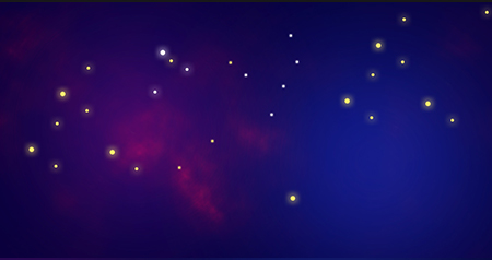
Having drawn our stars, you should disable the lower layers and save the file as image-2 in PNG format with transparent background
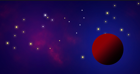
Let's add a third graphic element to our space - planets. Planets’ rendering in Photoshop is very a very interesting stage. Though, it is not very difficult, but requires some skills, that’s why I will try to explain everything in steps to make it understandable even for beginners.
Let’s begin – first, you need to draw a simple circle using the elliptical marquee tool with pinched Shift button for a perfectly circular path, then you fill it with desired gradient of colors. I chose red and black to make our planet more volumetric.
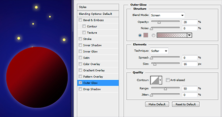
Then we will try to set the style for the planet layer - try setting the styles Outer Glove and set the following parameters Blend Mode - Screen Opacity 27% Size 16px Range 50%
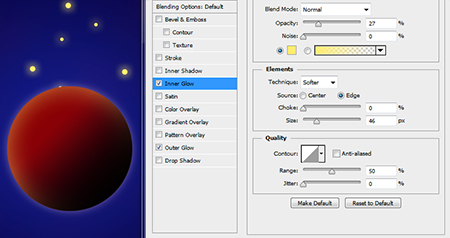
Then let’s use Inner Glove for some volume. Configure the Inner Glove with the following parameters: Blend Mode - Normal Opacity 27% Color: # ffed72 Size 46px Range 50%
To make the planet more realistic, you need to add a special texture to create craters and mountains on the planet. You just need to look for the texture on any site with free textures. I recommend the granite stone texture, as it suits this stage the best.
Now, we open the texture in Photoshop and add it to the Texture library - Edit - Define Pattern ...
Now, back again to our layer (Layer) with the planet. Let’s give it another style with Pattern Overlay – Pattern texture. Choose from the texture Library granite texture and set the following parameters: Blending Mode - Lighten opacity 30% Scale 100%
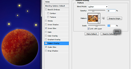
Finally, we have created our planet. Now you can play with different textures and different gradients or change the size of the circle.
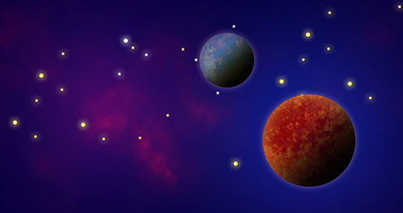
Let’s save our planets on a transparent background. For this, disable all the lower level layers and save for web as image-3 in PNG format with transparent background
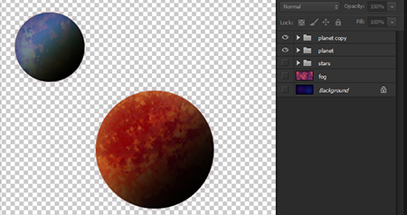
In this step, we finished preparing graphics for our parallax headers. As a result, we have created 3 separate images - image-1.jpg, image-2.png and image-3.png
For parallax scrolling, we use the Jquery plug-in which is already done :
http://www.jquery4u.com/demos/jquery4u-parallax-demo
Also you can read the detailed installation instructions for this plugin here : http://www.jquery4u.com/animation/jquery-parallax-tutorial
In conclusion, this article is focused on web designers of all levels. All layouts are drawn in a simplified form for easy understanding of the parallax idea. You can try various design options for parallax scrolling.
Good luck and have fun with this effect!
See also: Flat Design and Its Methods. Do You Know a Lot About This Trend?

