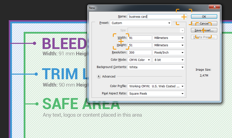
Width: 91 mm
Height: 51 mm
Resolution: 300 dpi (pixels/inc)
Color Mode: CMYK Color
We can save this preset in order not to enter this information once again. You can do that by clicking Save Preset and OK.
Now the document template opens. Its dimensions are standard for all the business cards
The next step will be to indicate “safe areas for the text”. Please keep in mind that the important text, for instance, the name of a person or phone numbers, should not be placed too close to the business card edges. Let’s leave 5-10 mm margin on each of the edges
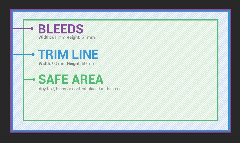
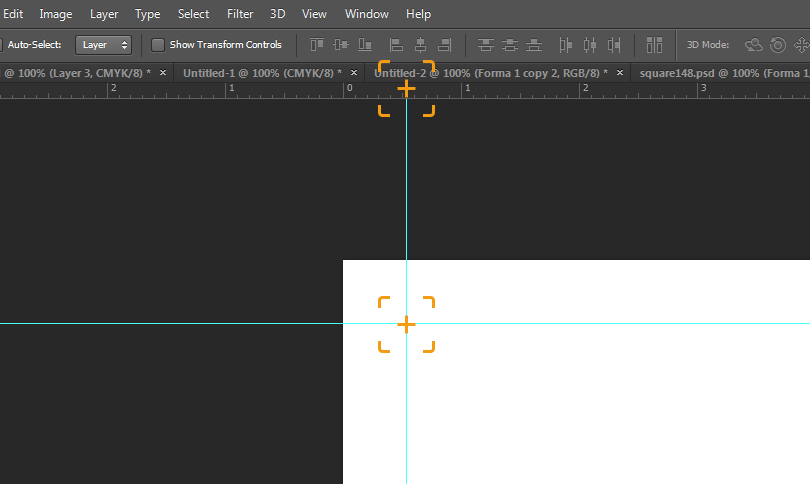
For convenience and in order not to go beyond our “safe area” we can use Slices
Once our template is ready, you can start designing the business card layout. Before that, you should learn the following basic rules:
1) A business card is your face or the face of your company. Make sure you do not spoil it by including too many elements, dozens of phone numbers, emails or your business partners’ and friends’ logos. Leave the main information only: the logo of your company or brand, your name and position, one or two phone numbers, a website address or an email – that should be enough to identify you.
2) Choose distinct and easily readable fonts. Do not use comic or too thin fonts. Give preference to classic and well-known fonts for the information text instead.
3) Use contrasting colors identifying your brand or company. If you don’t have any, it will be enough just to choose 2 colors contrasting with each other. Their combination should be perceived well visually: black and white, white and red, green and white, etc. There are many online services allowing choosing the color range. Some of them have already been mentioned in my blog.
4) Try not to put the name and the contact phone number in different corners. That may cause certain difficulties. For example, a person takes a business card in order to dial your number, and shields your name with a finger. That may lead to confusion during the conversation.
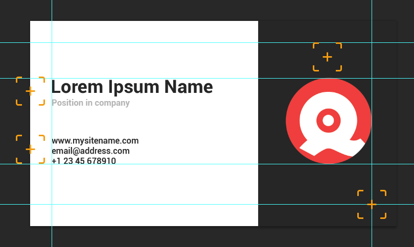
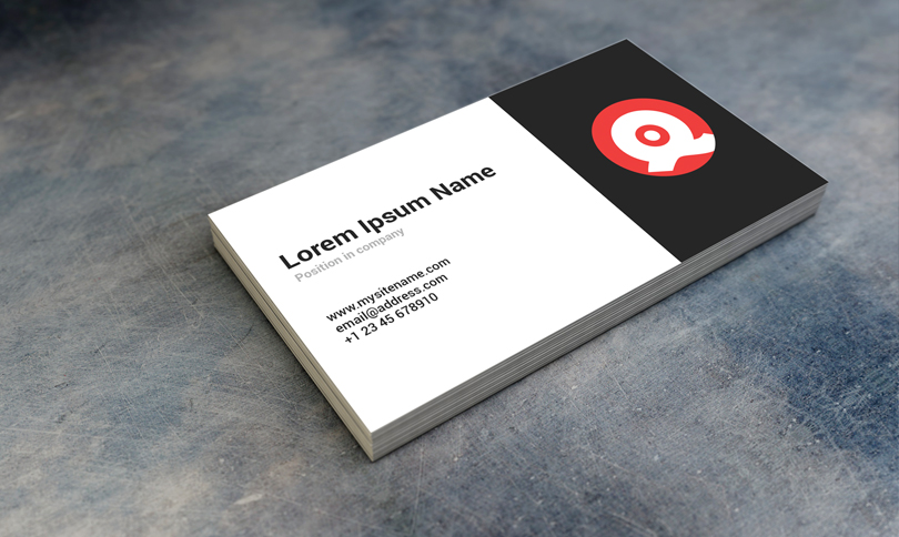
Here is an example of a very simple business card which took me 15 minutes to draw in Photoshop. As you may have noticed, I stayed within the “safe area” by strictly adhering to the slices. Also, I used the contrasting colors and the text blocks layout according to the rules above. Of course there should be no boundaries to your creativity, and you can try different variants, but before printing out the large number of business card copies you should prepare a test batch consisting of 20-50 cards, and make sure everything is clear to the person you give that business card to
If the business card layout is ready and has to be saved, let’s prepare the file for printing or sending to the printing company.
Go to File – Save as, then select the TIFF or PDF format (both formats are good for printing the business cards at the printing company), remove a tick from the check-box Layers
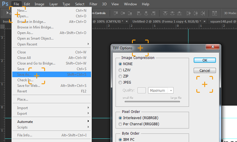
and then click Save. Now you’ve got the files ready for printing at the printing company!
P.S. Do not use RGB color mode for the layouts that are to be printed at the printing bureau, because their colors after printing will differ from those you see on the computer screen. Also, the layouts should not be saved in JPG or PNG formats – they may lose clarity. Always keep in mind that the number of dots per inch for business card layouts should be 300 DPI.
P.P.S. At each printing bureau, they have their own printing requirements list. Make sure you’ve learnt them before sending your layouts to be printed. In this tutorial, I’ve provided the requirements followed by most of the printing companies, but there may be exceptions as well

Business cards mockups archives