Today, the amount of users who use mobile devices for their web activities is about to exceed the number of PC users.
And with the new adaptive design for mobile devices and the release of the iPad, a new trend has appeared with the retina display. Retina Display is a brand name used by Apple for liquid crystal displays which they claim have a high enough pixel density that the human eye is unable to notice pixelation at a typical viewing distance.
The term is used for several Apple products, including the iPhone, iPod Touch, iPad, and MacBook Pro. As the typical viewing distance is different depending on each device's usage, the pixels per inch claimed to be of retina quality can be different depending on the size of the display, with higher ppi for smaller displays and lower ppi for larger displays: 326 ppi for the smallest devices (iPhone and iPod Touch), 264 ppi for mid-sized devices (iPad) and 220 ppi for larger devices (MacBook Pro).
This technology is based on the theory that the human eye cannot distinguish 330ppi, as a result Pixelate almost invisible.
The essence lies in the clarity increment and the screen extension. This brings relevant questions to design and in layout. First you need to understand the terminology clearly.
Physical pixel is the smallest unit of a digital image with corresponding color .
Screen density means the direct quantity to display physical pixels.
CSS-pixel is an abstract value to display page elements not depending on monitor size.
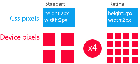
So, what is the difference between these parameters: conventional displays and retina?
If the block’s size is 20px width, 40px height, then the retina ratio aspect will be 40px width, 80px height, because each bitmap pixel is 4 times multiplied.

Optimization Methods
1.HTML
<img src='retinax2.jpg' width='20px'
height='40px'>- this approach is best applied
for one-page sites.
2.CSS
You can set the desired size of the background image (background-size), but the background-size parameter is not supported in IE7 and IE8 versions.
background-image:
url (retinax2.jpg); background-size: 20px 80px;
However, this solution is not universal and it is better to use this approach:
.Retina{
background-image: url (standart.jpg);
background-size: 20px 40px;
height: 20px;
width: 40px;
}
@Media only
screen and (-webkit-min-device-pixel-ratio: 1.5),
         only screen and (min-resolution:
144dpi) {
.retina {
background: url (retinax2.png) no-repeat;
background-size: 40px 80px;
}
}
3.Javascript
  if
(window.devicePixelRatio> 1) {
    var
smallImg = $ ('img');
    images.each
(function (index) {
      var
small = $ (this). attr ('src');
      var
retina = small.replace (".", "@ 2x.");
      $
(This). Attr ('src', retina);
});
}
This code replaces all images with higher pixel density images.
You can also use retina.js plugin, which makes almost the same, but has more features.
4.SVG-vector approach
The Pixelate raster problem when image zooming can be circumvented by using vector elements such as SVG
. Retina {
  background-image:
url (retina.svg);
  background-size:
20px 40px;
  height:
20px;
  width:
40px;
}
5.Apple set
Apple has developed a special set, which can use various image options, depending on the density of the monitor. This method does not work in the middle of the img tag!!!!
Retina {
  background-image:-Webkit-image-set
(url (small.png) 1x, url (large.png) 2x);
  background-size:
20px 40px;
}
An alternative solution is to use an item picture
<picture
width="500" height="500">
   <source
media="(min-width: 45em)" src="large.jpg">
   <source
media="(min-width: 18em)" src="med.jpg">
   <source
src="small.jpg">
   <img
src="small.jpg" alt="">
   <p>
Accessible text </ p>
</
Picture>
currently <picture> is only a demo version.
See also: Simple Guide to Add Twitter Authorization on Your Website

