With the development of adaptive design (responsive design) was invented specifically to resolve this issue. Responsive design means creating the layout and design so that the website will look equally well on all devices with different screen resolutions. This is a relatively young technology, but we believe that it is the future of all sites. As the ability to access the Internet on many different mobile devices grows, it is necessary to have this technology.
Let’s look at the responsive design from the designer's point of view. The first thing you should note, before you start making sketches for your web design is what is the recommended screen resolution for different devices. These sets of extensions are recommended and can serve you as a starting point:
Desktops, PCs and tablets
800х600
1024x768 (iPad)
1280х1024
1600х900
Mobile devices
640х480
480х320 (iPhone)
320х240 (other popular smartphones)
Choose three main resolutions you will work with. This situation is somewhat more complicated for the designer. Instead of giving the programmer standard layout for further work on creating the website, the page needs to be displayed in three dimensions (sizes) to show how the content should be placed depending on resolutions of the different devices.
You should start to draw a web site layout on the largest resolution you’ve chosen. For example, it should be 1600 pixels wide for most wide screen desktops. I recommend you to make a few sketches on paper before you start to design layouts with your favorite and convenient graphic editor. This will simplify your work and save you time in the future.
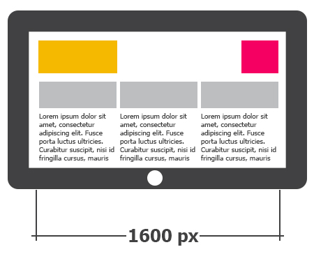
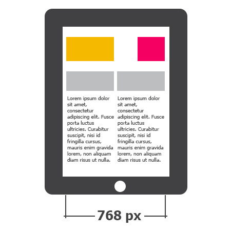
When you finish drawing your web-page layout for the largest screen resolution, you can start drawing designs for mobile devices like tablet with horizontal extensions 1024px and 800px. At the same time, try not to change the graphic elements themselves, but just to move data blocks more vertically, making the horizontal width of the web page narrow.
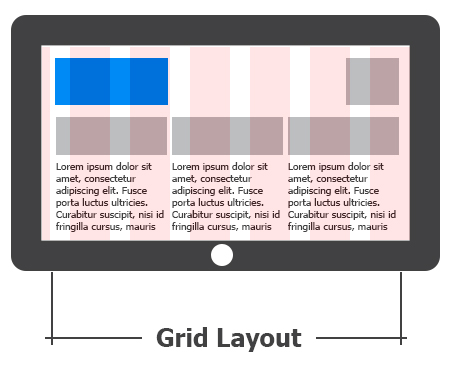
It is also recommended to use grid layout to align blocks of content.
The same situation is with the layout design for minimal extensions of smartphones. You should try to decrease your design for appropriate display on the mobile device by reducing the horizontal distance between the elements.
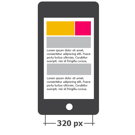
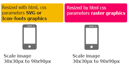
You should also remember, to make the design adaptive (responsive), it is best to draw everything in blocks that can be easily transformed –if you want to decrease the width or to change its position from horizontal to vertical column by changing the size of the screen. Also, remember about decreasing of the number of bitmaps in the templates design. You should use bitmaps only in those elements of web design where they should be - including logos that are parts of the brand and can’t be changed and the icons for better visual perception of the website sections.
By the way, when using the icons you should use SVG format which doesn’t change their quality when increasing or decreasing by coding. There is also an alternative visual display of icons not as images, but with help of special icon-fonts. For this you should select special fonts or use online tools such as http://fontello.com and http://icomoon.io/app that offer a variety of free solutions for these problems.
So, let’s summarize.....While developing a new web design, you need to make sure it is adaptive and can be easily adapted to any mobile gadget (Here is why). And, it should be easy for the user to obtain the desired information and to navigate between sections of the site.
See also: Time-Lapse. The things you need to know

