Hello to all readers of Ukietech blog.
Today, I want to share with you the latest responsive design and web page layout. Because the new wireless technologies are rapidly developing and give the internet-user significantly higher quality access to the necessary resources. This also applies to mobile web browsers and won’t concede to browsers of desktop systems and can easily show all web page elements, which are created using HTML5 and CSS3.
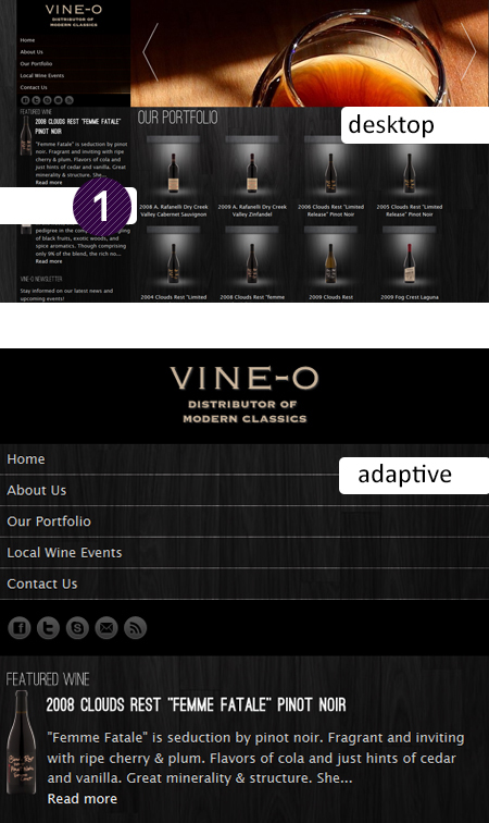
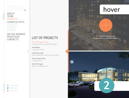
Effects take second place. These effects will give our web design characteristics of a living organism and responsiveness to any user actions. The interaction between website and the user significantly increases due to various effects using CSS3, HTML5 JS frameworks Jquery, Mootools and others. Such an interaction may be shown as different hover effects, access to different content parts without webpage reloads, and Ajax reload pages.
All or nothing. Maximalism and Minimalism are two completely ideals on opposite sides of web design and take third and fourth place after the aforementioned. Let’s consider each separately and in more detail.
Maximalism - More is more
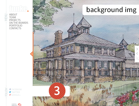
With Maximalism web design, you can immediately recognize by a large background image, that occupies almost the entire visible web design page. It may be photos, parallax effects in which two or more images are overlapping and moving with different speed one relative to the other while scrolling the webpage or reacting to the mouse cursor.
Minimalism - Less is more
In minimalism, everything is exactly the opposite. The web design is very neat and discreet with white space as part of the design. The use of various small textures for background image(s), and the structure of the site can literally be on one page, this means all the content is placed on the same page, and the navigation is through the menu which links are tied with section headings through the system anchor links.
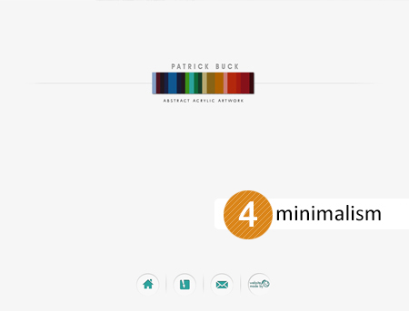
Note, that in minimalism web design, you should keep in mind usability and that the menus should be fixed in place, in order, for the navigation menu to permanently stay in view of the user so the user has easy access to it at all times.
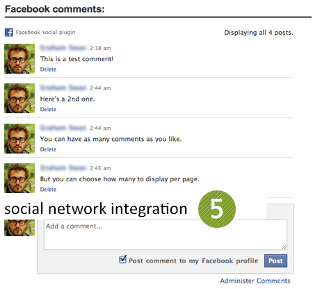
The integration of social networks is the fifth trend. To facilitate access to private sections of a web site, you should provide the user a variety of alternative methods of authorization on the site, and can be attributed to such registration and authentication via Facebook and Twitter.
Let’s summarize the 5 trends. So, if you want to have an up-to-date, cutting-edge and comfortable website design you should remember these things:
1. Try to design a responsive website functionally
2. Use different effects, parallax, slideshow or background pictures with HTML5, CSS3, Jquery to make your website more alive.
3. Don’t be afraid of using minimalism or minimalism in website design
4. Use Google fonts for interesting typography
5. Use infographics
6. Use animated character(s) for your website
7. Try to use metro-style and refuse from gradients
8. Watch that all links or other website elements interact with user, use interesting hover-effects
9. Try to use one page website design variants for website with small amount of content
10. Try to use a mega-menu or menus with many columns.
11. Remember about social media integration. It helps the user authorization and adds traffic to your website.
See also: Emotional design - best way to evoke positive feedback!

