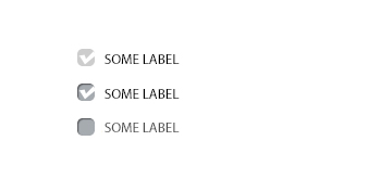
In many of my past projects, I have used CSS and Java scripts to design custom checkboxes and radio buttons. Because of this, a few weeks ago I decided to optimize the code a little bit. The below examples work on all new browsers. The only thing that will limit you is following the tags structure:
<div>
    <input type="checkbox" id="someCheckbox" />
    <label for="someCheckbox">Label</label>
</div>
This means that the input and the label must be in one block and the input always must be before the label in code. To achieve the desired effect, as shown in the picture we only need to label. You can achieve the desired effect, using CSS attributes, adjacent sibling selector "+" and pseudo-classes.
Here is a simple example of a checkbox implementation

#someCheckbox {
     display: none;
}
#someCheckbox + label {
    position: relative;
    display: inline-block;
    padding-left: 22px;
    line-height: 16px;
    cursor: pointer;
}
Pseudo-classes, such as before and after, give you an opportunity to use 2 block elements to customize your checkbox.
#someCheckbox + label:before {
    content: '';
    position: absolute;
    left: 0px;
    top: 0px;
    width: 16px;
    height: 16px;
    box-shadow: inset 1px 1px 1px rgba(0, 0, 0, 0.5);
    overflow: hidden;
    border-radius: 5px;
    cursor: pointer;
    background: #a6a9ae url(our-custom-checkbox.png) -16px
                                            0 no-repeat;
    transition: background-position ease 0.2s;
}
#someCheckbox:checked + label:before {
    background-position: 0 0;
}
#someCheckbox[disabled] + label:before {
    box-shadow: none;
    background-color: #ccc;
}
To reach the optimized effect you can also use more pseudo elements such as :focus, :active and :hover to give the effect during focus and pressing, :after to additional stylization. Property transition allows you to use additional animation in your inputs.
See also: Zen coding – the method of quick coding

