Copywriting tips from graphic designers
Here at Ukietech we often have professional battles because, we are very passionate about what we do. Sometimes they are low level discussions, sometimes they get more heated and passionate and sometimes it escalates to the highest court of justice which is the Bosses cabinet.
The most knock-down-drag-out disputes, however, seem
to be between designers and programmers concerning design issues like
customized scrolls or Marketing Dep. VS Art Dep. regarding
user-friendliness of a website.

Nevertheless, in the end, we make
our peace and take into account our counterpart’s point of view. We are
all professionals in our own discipline… so why not stand our ground?
This real story, though, is about what lessons our art department has taught us, concerning…. copywriting!
Brace yourself!
Here they are….
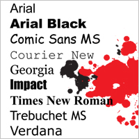
Lesson #1 “Fonts” It’s
no secret that all designers are passionate about fonts. They collect
them, they design them, they know all their names by heart and have
their die hard favorite ones. Nevertheless, they seem to always fall
back on using simple readable fonts like san serif for online reading.
One of the most important things about reading copy is to not use too
many different fonts at the same time.
It’s basically a crime in the
eyes of a designer. Multiple fonts comes off messy, unfocused and
disrupts the readers attention. Choose a maximum of 3 readable fonts and stick to them throughout the website.
Lesson #2 “Headings”
Designers
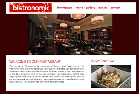
do not like a lot of copy, but, they can tolerate headlines. Make sure
your headlines are big enough to catch the readers attention and we
recommend making headlines a different color to attract the eye. Make
sure the colors you use are complementary and blend harmoniously with
the rest of the design and color scheme.
It is hard for us,
marketing professionals, to resist putting big red headlines to
accompany our copy, but we know that we have to stay in check with the
general design concept and vision of the website. So much so, that we
really are on the same side as the designers. Readers will still notice
your headline and copy, now they just won’t be distracted by an
overabundance of color and distractions. A well-designed site with a
harmonious use of color leaves the reader with an overall positive
impression of the website.
Lesson # 3 “Make it short”
Write your paragraphs and sentences short.
They look better.
And, they are more likely to be read.
Lesson #4 “Pictures”
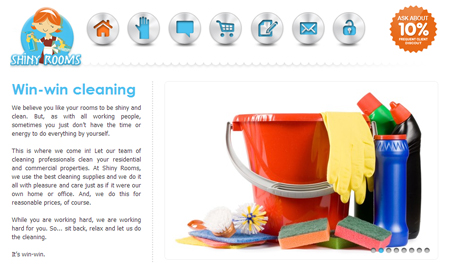
Pictures, images and photos are more eye-catching than text.
Pictures attract attention more than text.
Pictures are more expressive.
Well, I have to say it, a picture says a thousand words!
Hurray!...
Lesson #5 “Get rid of text”
Now… I know what you are thinking, and yes, it is not a mistake. People are too lazy to read.
My
recommendation is to use any visual media such as pictures, images,
photos, videos, icons and any visual representation you can whenever
possible.
See also: 7 Obvious Marketing Principles We Forget to Follow


