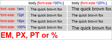
Today we will talk about some nuances regarding webpage layout. Mostly, our conversation will be about the method of defining font size with special attention being paid to the Em unit.
What is the Em and how do you use it in setting the font size? It should be understood that 1 Em is a certain size calculation unit, and it equals 16 px (1em=16px). For an easier calculation and webpage layout with font-size, given at “Em” you should reduce the basic size from 16 px to 10 px. For this, you have to announce this change in your CSS file as body { font-size: 62.5%; }. As result, we get a slight value of a calculation unit “Em”, which now will be calculated by the ratio 1em=10px а 0,1em=1px.
Using “Em” as the basic unit for font-size allows the user to get the same font view at all monitors and browsers.

What is the difference between setting font-size at Px and Em. The matter is that some browsers find that font-size given at Px as absolute value and doesn’t change it relative to screen resolution. As a result, the text with the font-size, given at Px may be very small and not readable.
Example
body {
font-size: 62.5%; /* reduce the basic size to 1em=10px*/
}

h1 {
font-size:2em; /* set the font-size to all heading h1 2em */
}
Let’s consider the value of a font-size, given at point (pt) and percent (%)
The font-size at point usually is used for pages, which will be printed and given at CSS files by the specific rule @media print.
For example, to set the font-size on the printed page the same as on the screen, you should set a certain parameter in your CSS file, which will look like below.
Example
@media print { /* Styles for printed pages */
body {
font-family: Times, 'Times New Roman', serif;
 /* Sharper fonts*/
}

h1, h2, p {
font-size:14pt; /* the font-size 14 points is
the same as the font given at MS Word 14 size*/
color: #000000; /* text color is clear black */
}

}
The last method of sizing is setting the font-size at a percent (%). It is a universal method and it may be used in combination with other methods of setting font-size. There are no certain nuances for this combination. There is just one recommendation to use this method in combination with em unit “Em”, as the different browsers can reflect the fonts in a different way.
There is the default function of font smoothing in browser Safari. But this function is unknown in Firefox or Opera, as result the visual perception of font-size will significantly differ, especially its font-size, given at pixels (px).
See also: Using symbols in writing attractive content to your blog

