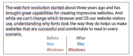
The web font revolution started about three years ago and has brought great capabilities for creating impressive websites. And while we can’t change which browser and OS our website visitors use, understanding why fonts look the way they do helps us make websites that are successful and comfortable to read in every scenario.
Web font usage is a little different than the traditional print usage. Nowadays, almost all web browsers have own engine that choose how to turn your markup and scripts into living websites. Mainstream browsers interpret fonts’ vertical metrics in a different ways. These should be avoided.
So, we need understand and remember some recomendations.
1) Always set a line-height numeric CSS property. Some people, of course, will use web fonts without doing that :)
2) Always specify an explicit line-height CSS property (for example, 1.2), rather than relying on “line-height: normal”. The latter cannot be made to be completely consistent across all browsers, and is also likely to change as the vertical space budget is increased to extend fonts into more international scripts. (more tentative:)
3) Specify ClearType collection font (eg Calibri, Cambria) as the next fallback in the CSS stack.

Certainly you can simply use fonts with updated vertical metrics.
Another solution is to take the TTF font out of the downloaded kit and use it to export a new @font-face kit with Font Squirrel's generator. The generator has a checkbox in the Expert Settings labeled "Fix Vertical Metrics". Make sure this is checked before you generate your kit.
Incorrectly set vertical metrics can cause many different problems. The worst are clipping (primarily on Windows) and inconsistency from browser to browser.
See also: $(document).ready vs $(window).load

