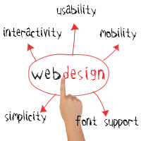
It’s no secret that the top web designers are a student of design and
keep up with latest trends (if they are not creating the latest trends)
in web design and development. Trends and design techniques are
ever-changing, and web designers are always pushing the envelope,
thinking outside of the box, and taking risks by experimenting and
inventing new ideas and methods that increase the number of website
visitors and traffic.
Lots of new perspectives and ideas, in terms of web design, have appeared lately. The design landscape today includes mobile devices that have become quite commonplace and ubiquitous; web typography and fonts that have reached new creative levels, and new programming techniques that have opened new opportunities in finding fresh, creative design solutions.
Now, I am
going to talk about some of the recent trends that are popular today,
new items and new approaches that have emerged and formed the
contemporary web design landscape.
So let's plunge into some of
the current trends of web design.
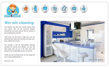
1. Focus on simplicity and
usability / Minimalism
Minimalism in web design is very popular, and
the leader in this category is Apple. Their branding and design is one
of less is more. This idea is simply that there is nothing superfluous
and nothing distracts visitors’ attention from the message or content.
Modern design has shifted toward clear, concise design with clarity and
easy-to-use website navigation. Website visitors should be able to
easily navigate to where they want to go. This equates to simplified
navigation, reduction in the number of graphic elements and effective
placement of blocks on the site.
2. Interactivity + mobility
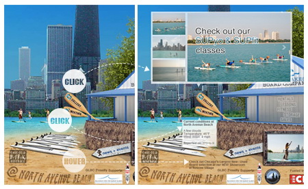
One of the most unexpected trends in design is the widespread usage of CSS3 and HTML5. Many web designers have started to abandon Flash in favor of HTML5. And, not all browsers have become accustomed to CSS3, but they are getting there slowly. Among CSS3’s new features, I would highlight curved corners, drop-down menus, animated buttons, complex backgrounds, shadow effects on objects and text, translucent images and much more. HTML5, CSS3 and jQuery technologies allow any design to interact and work together. All these elements include roll-over mouse movements and touch screens. This allows you not only to view the site, but to explore, experience and reveal a more dynamic effect.
Today, people
are buying more mobile devices such as smartphones, iPads, and tablets
than traditional desktop PCs. With the proliferation of mobile devices,
designers have to keep this in mind about site design and navigation
paying special attention to design for these devices.
3. Font Support
Tired of Arial’s simplicity? Bored with graceful serifs of Times New
Roman? It is easy to overlook typography and fonts as design in of
itself. But, now the Google library of fonts possesses hundreds of
fonts, web optimized and easily embedded into the style sheet. So, there
is a trend that designers are starting to focus more on font styles and
taking more risks when it comes to typography. Bold stroke, curled
letters and unconventionally large font sizes become commonplace to draw
the users’ attention.
4. Color
Color still plays a prominent and major
role in cutting-edge modern web design. Choosing the color palette and
emphasis is particularly important. From my observations, gray has
acquired a fundamental popularity lately. Its hues are used as the
background for images and text boxes. Gray always looks stylish and in
fashion and goes well with the basics with black and white. While many
designers still prefer the classic version of white, gray and black,
modern web design has a place for absolutely any color. So have fun and
don’t be afraid to use color.
5. Background
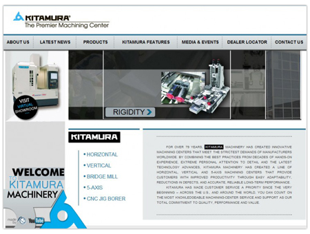
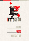 The white or free space
plays perhaps the most important role. Hollow background, usually white,
is the basis of any modern web design. It is the free space around the
element that regulates the overall composition and defines an hierarchy
of elements. Background texture is also popular, as long as it is
unobtrusive and doesn’t detract from the focal point for the site.
Particular attention should be paid to the websites with a simple look,
these background textures sharpen and fill the overall look and feel
with internal depth.
How can I summarize? Traditional web design is
moving towards satisfying the mobile device interface and getting rid of
the stereotypes from the past. Functionality and usability are at the
forefront.
See also:
7 Top Reasons Why They Leave Your Website and learn how to avoid it.

